Client
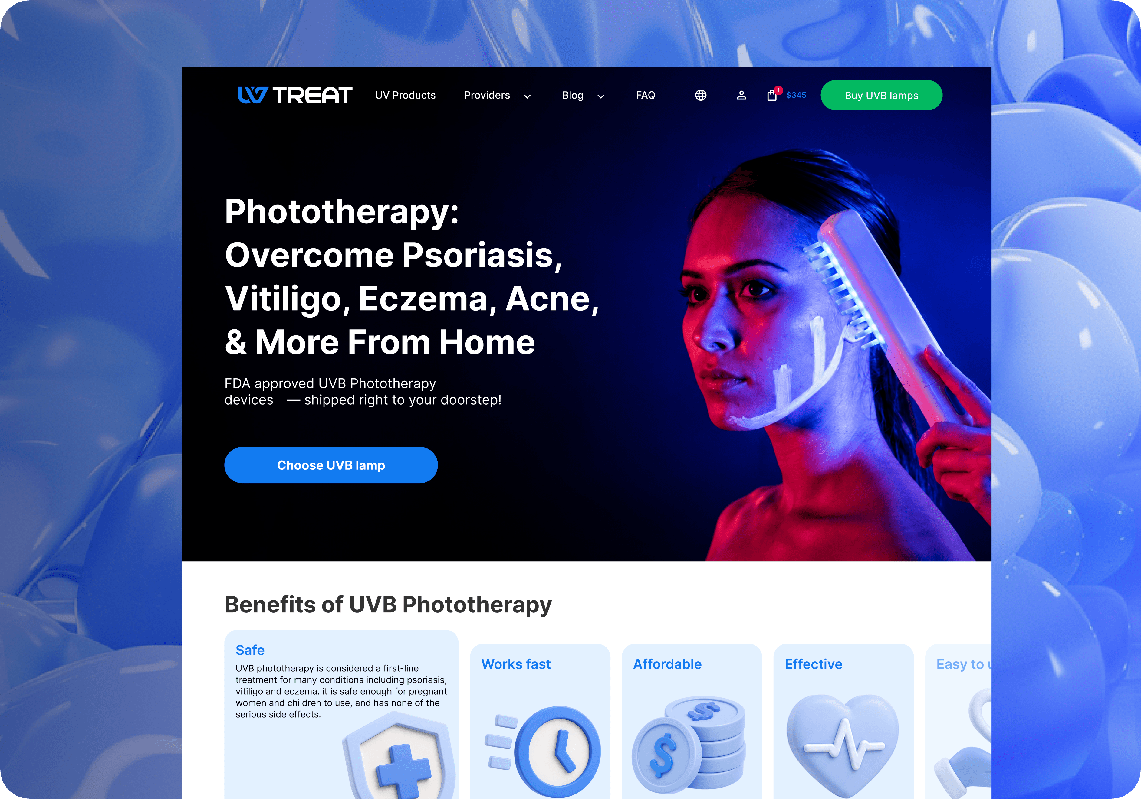
Redesigning discovery, product pages and checkout for a healthcare e-commerce platform with 25K monthly active users. Purchase conversion increased by 18%.

Beyond the first scan
Plantix is a graduation project exploring what happens after a plant is identified. A scan can name a plant or suggest a problem, but people still need to understand the result and decide what to do next.
I led a two-designer team, owning product direction, UX architecture, core flows and final design decisions. I also worked on research, prototyping, UI and testing.

Research shifted the focus to ongoing care
Interviews, a survey with 30 plant owners and a review of existing apps showed that identification only solves a brief moment. People needed to know why their plant was changing, how serious it was and which advice applied to them.
Beginners wanted a plain-language answer and a next step. Experienced owners wanted history, trends and control. I used progressive depth: a clear answer first, with detailed information available when needed.
Turning traffic into confident purchases
UV Treat sells at-home treatment devices for people managing chronic skin conditions. The site had around 25K monthly active users, but many left before completing a purchase.
As Product & UX/UI Designer, I worked across navigation, discovery, product pages and checkout. I combined analytics, interviews, a UX audit, competitor research and journey mapping to understand the friction before changing the interface.
The catalogue did not match how people searched
The starting picture was clear: a 68% bounce rate, roughly two-minute sessions and only 3% of users who added a product to cart completing a purchase. Mobile accounted for 73% of traffic.
Customers arrived with a condition in mind, not knowledge of device categories. I reorganised discovery around conditions and user needs, then used card sorting and testing to check how products, instructions, reviews and support should be grouped.

Product pages that answer the buying questions
People needed to understand whether a device suited their condition, how to use it, what evidence supported it and what to expect after buying. Key information was scattered or easy to miss.
I brought usage guidance, expert information, reviews, guarantees and purchase conditions closer to the product and purchase action. The goal was to help people make an informed decision with less searching.


Checkout went from four screens to two
I removed repeated input, added autocomplete and made order information editable without sending people backwards. Validation, delivery, payment and order details received a clearer hierarchy.
With most traffic coming from mobile, small-screen checkout was the primary constraint. Completion time fell from roughly three minutes to one and a half.

Testing changed where reassurance belonged
Wireframes and prototypes supported usability testing and A/B tests. Condition-based discovery performed better, clearer expert information received more interaction, and product-card clicks increased by 25%.
One hypothesis failed: putting dermatologist chat inside checkout. It added another decision and distracted people who were ready to buy. I moved it into the Q&A and support context instead.
Results after implementation
Purchase conversion increased by 18%, cart abandonment decreased by 12%, average time on site increased by 15% and product-card clicks increased by 25%. Checkout time was cut in half.
The redesign also established a more consistent responsive interface and reusable patterns for future work.
What I took from the project
A checkout problem can begin long before payment. Navigation, product understanding, trust and content all shape the decision. Connecting those parts was more useful than optimising individual screens in isolation.
The chat experiment reinforced the value of testing: reassurance helps only when it appears at the right moment.
DISCOVER MORE


