Club Duchi Experience

Club Duchi Experience

Club Duchi Experience

Scope

Fashion / AI / Mobile Apps

Product Category

Fashion · AI-driven Personalization · Mobile App

Designing an AI-Powered Fashion Experience That Feels Personal, Simple, and Human

Designing an intuitive AI fashion experience that users can trust from the first interaction

Club Duchi Experience is a travel and experience platform focused on premium stays, curated trips, and exclusive offerings. The business goal was to create a digital product that reflects a high-end brand positioning while making complex booking scenarios feel simple, intuitive, and trustworthy for users.

Before the redesign, the platform lacked a clear UX structure. Users struggled to navigate the content, understand available options, and confidently move toward booking. The challenge was not purely visual — it required reorganizing information, reducing cognitive load, and guiding users through decision-making without breaking the premium feel of the brand.

My role was to design a clear, user-centered website that balances aesthetics with usability. The focus was on structuring the experience around real user needs, simplifying booking flows, and building a scalable UX foundation that supports both current offerings and future product growth.
Dazzle Logo with sign vertical
Project Gallery Image for 50% width of the screen #1
Project Gallery Image for 50% width of the screen #2

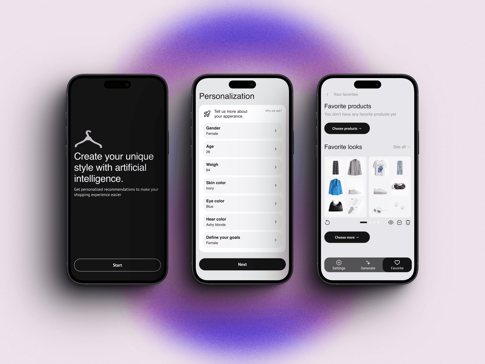
From complex AI logic to confident user experience

The final design focused on simplicity, clarity, and progressive disclosure of AI features. User flows reduced cognitive load and helped users understand the value of personalization step by step. The product became easier to navigate, more trustworthy, and emotionally engaging. Stylee is now positioned as a friendly AI assistant rather than a black-box system — ready for MVP validation and future scaling.
  • The image featured in the carousel #1
  • The image featured in the carousel #2
  • The image featured in the carousel #3
  • The image featured in the carousel #4
  • The image featured in the carousel #1
  • The image featured in the carousel #2
  • The image featured in the carousel #3
  • The image featured in the carousel #4
  • The image featured in the carousel #1
  • The image featured in the carousel #2
  • The image featured in the carousel #3
  • The image featured in the carousel #4